UI Design
Research
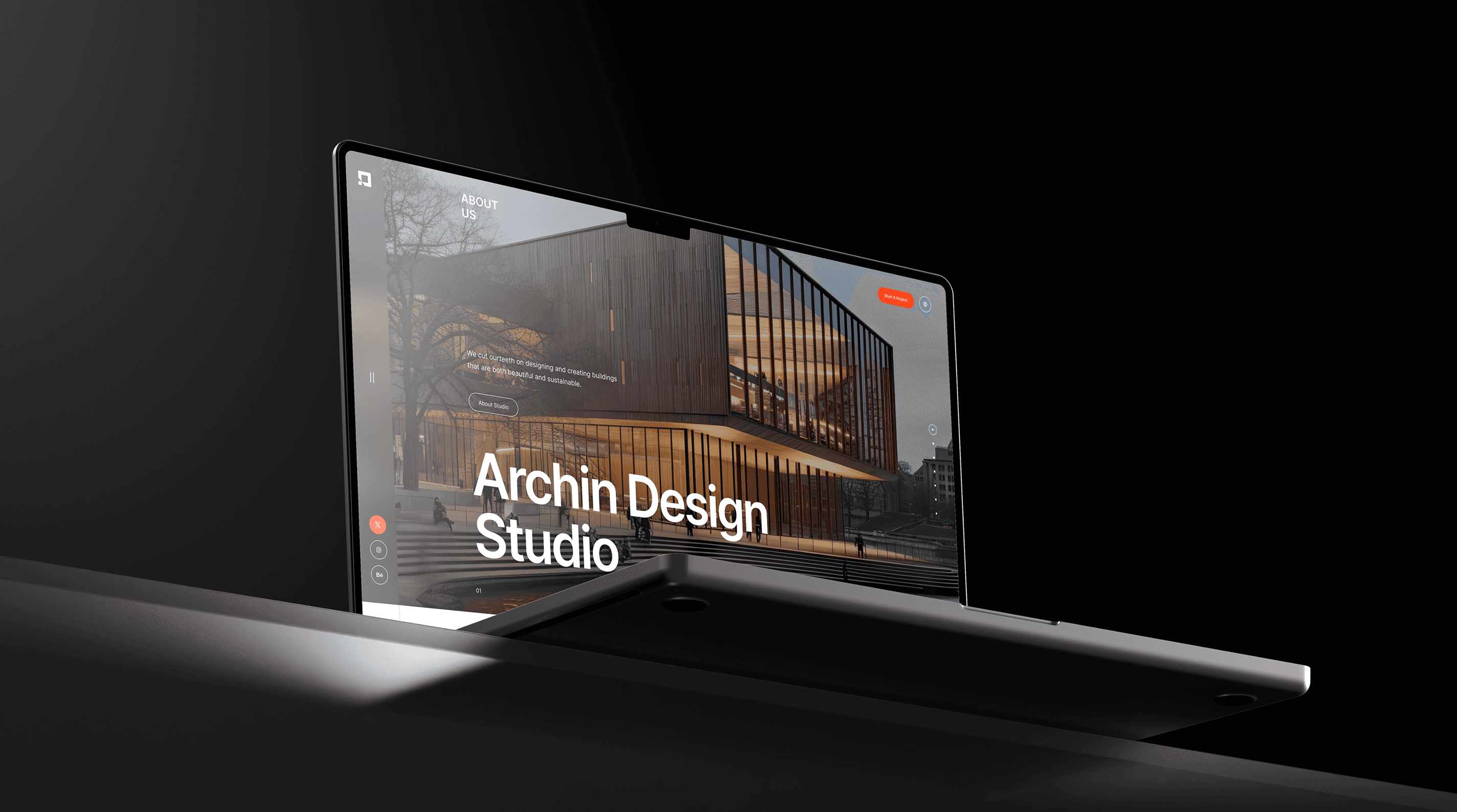
Discovery & Strategy
We began with an in-depth discovery phase, which included a brand audit, competitor research, and collaborative workshops with the best studio’s co-founders. Through this process, we uncovered their desire for a calm, structured identity that echoes their architectural way of approach. Together we defined the tone and mood of the brand as clean grounded and sophisticated. We then mapped out a design at the directions rooted in architectural geometries, timeless typography, and a refined earthy color palettes, laying the foundations for the visual identity and website to follow.
It became evident that their brand needed to be quiet, intelligent, and structured—mirroring the way they approach spatial design. We had a strategy around a concept we called “Architectural Presence”: a blend of clarity, restraint, and identity. This helped steer the direction for both branding and digital design decisions, setting a strong conceptual backbone for all creative work ahead.

Creation & Deliverables
When the MediShield team first contacted me, they provided limited context about the project and requested a few initial screens for the application. After reviewing their existing platform and conducting discussions with stakeholders, I discovered that the product was intended to streamline healthcare plan enrollment for agents in the field.
The primary objective was to transform key features from their web platform into a mobile-first experience that agents could use anytime, anywhere.
To better understand the problem and identify opportunities, I conducted a two-week research phase that included:
Studying healthcare agent workflows and daily processes.
Reviewing existing medical insurance applications and enrollment platforms.
Conducting UX research to understand user pain points, behaviors, and demographics.
Helllo
Application discovery began with multiple sessions with the QA team, who were acting as de facto business analysts. I also held stakeholder meetings with the CEO to understand his vision, product goals, and competitor references, while meeting developers and tech leads to understand why certain modules were incomplete. Key insights emerged quickly: the ERP needed to handle vast hierarchical data, parent-child relationships, subcategories, and groups; forms with 20–50 fields created usability and development challenges; and the team needed designs that were clear enough to build without ambiguity.
Understanding the Users
Primary Users: Construction Professionals
The primary users were construction industry professionals who typically relied on Excel sheets and physical documents to manage project data — budgets, personnel records, equipment, materials, and project progress. Their pain points were fragmented tools, manual workflows, and inefficient tracking across multiple active projects.
Secondary Users: Development Team
Designing for developers was equally critical. I created developer personas to account for freshers who needed detailed prototypes and straightforward designs, as well as experienced backend developers who needed interfaces that respected complex data structures and retrieval logic.
Designing for Feasibility
The goal was not only to make the ERP easier for construction teams to use, but also to make the design practical for a team with limited real-world experience to build. Every design decision had to reduce ambiguity, explain hierarchy, and support implementation under pressure.
Design Process
1. User Flows Over User Stories
Given the application’s complexity, I replaced traditional user stories with more than 50 detailed user flows for every module and submodule. These flows explained the actions users would perform at each stage, along with data inputs and outputs for every workflow.
2. Wireframes and Prototypes
We skipped basic low-fidelity screens, used pencil sketches to align quickly, and moved directly into high-fidelity wireframes in Figma. Prototypes demonstrated simplified tables, clear categorization, filtering options, and dynamic forms with collapsible sections to reduce visual clutter.
3. Data Visualization Solutions
To solve hierarchical data challenges, I designed patterns for parent-child relationships, grouping, and nested categories. Dashboards used interactive filters and drill-down views so users could navigate large datasets without losing context.
4. Reducing Form Fatigue
For forms containing 20–50 fields, I grouped inputs into logical sections, added collapsible areas, and suggested multi-step forms where the workflow needed a calmer, more manageable experience.
Development Collaboration
I delivered a comprehensive style guide covering fonts, colors, button styles, layouts, and standardized design elements for consistency across more than 1,200 screens. I also conducted design walkthroughs with developers and worked closely with the team through iterative feedback to keep the design feasible and aligned with technical constraints.
Challenges and Solutions
Challenge 1: The inexperienced team struggled with large-scale application logic and real-world workflows. I solved this by providing clear documentation, detailed user flows, and prototypes that reduced ambiguity. Challenge 2: Complex data relationships were difficult to represent clearly. I used expandable tables, nested views, and visual cues to simplify navigation. Challenge 3: The MVP had to be delivered by July 1st. I prioritized critical client-facing features and refined the design iteratively.
Results
The redesigned product met the deadline and was successfully handed off to the African client. Simplified workflows, reduced form fatigue, and clearer data visualization improved usability significantly. The developer-friendly documentation and walkthroughs also helped the team build with more confidence and efficiency.
Key Takeaways
1. User and Developer-Centric Design
Designing for end users and developers alike ensured the product was both usable and feasible to build. The best solution had to support construction professionals while also guiding the development team clearly.
2. Collaboration Is Key
Regular meetings with stakeholders, developers, and QA teams were essential for bridging gaps, clarifying requirements, and keeping the project moving toward a successful MVP.
3. Adapting to Constraints
Working with freshers, incomplete modules, and a tight deadline challenged me to think creatively and find practical solutions that balanced ideal UX with real delivery constraints.
Project Impact
Project on Track highlighted the importance of empathy, adaptability, and collaboration when designing complex enterprise solutions. It helped transform an ambitious but difficult ERP into a clearer MVP and helped me grow as a designer capable of tackling large-scale, high-pressure product work.
Conclusion
This project showed that enterprise design is not only about simplifying interfaces — it is also about simplifying communication, aligning teams, and turning scattered requirements into systems that people can understand, build, and use.
(Client Review)


“Sanjeel helped us bring structure and clarity to a very complex ERP product. His ability to understand construction workflows, simplify large data-heavy modules, and communicate designs clearly to our developers was critical in helping us move toward the MVP deadline.”
Project on Track Team
Construction ERP Stakeholder
(Project)